
6 GO-TO BENJAMIN MOORE PAINT COLORS

Painting your home can be a very daunting task. We’re often asked by clients what the go to paint colors are for the season. Our biggest advice? Stay away from trends and stick to colors that are both classic and timeless. In this blog, we’ve narrowed down our favorite paint colors that you will love for years to come. Everything from the perfect neutral to even the right shade of black. We’ve got you covered. You’ll notice no white colors are included. For a full recap of our top white paints, take a look at our most recent blog: HOW TO PICK THE PERFECT BENJAMIN MOORE WHITE PAINT.
Before we dive into the actual color selections, let’s recap our finish recommendations. First, we always suggest a flat paint on all ceilings, unless you are looking to accentuate them. Walls can be done in matte, eggshell, or satin. A matte will hide imperfections the most, while satin is great for a wipeable finish. We love to let trims and doors stand out, and will almost always use a satin or semi-gloss.
Now let’s talk colors! Benjamin Moore has such an incredible lineup of color choices. With so many options how can anyone begin to choose? Well, it all comes down to one question. What is the vibe you want to create? Are you looking to create a cozy and inviting atmosphere? Then you need a color with warm tones. If crisp and sophisticated is your goal, then a cool tone is where you need to be.
Now that you know the mood you want to create, it’s time to pick your paint color!

TRIED & TRUE:
CLASSIC GRAY (OC-23): Off-white meets warm light gray. This option is great if you’re afraid of color, but don’t want to go with a traditional white that may fall flat. You can’t go wrong with Classic Gray, as it’s the perfect neutral that warms up any space.

STONINGTON GRAY (HC-169): Perfect for both modern and traditional settings, Stonington Gray is one of the most popular neutral paint colors. The slight blue undertone gives it a cool yet inviting feel. While it’s light enough for a full wall, it still gives contrast against white trim and moldings.
METROPOLITAN (AF-690): Modern and sophisticated, Metropolitan is a neutral gray with cooler undertones. It’s the perfect backdrop for your beach vacation home.

WOW FACTOR:
CHARCOAL LINEN (2133-40): Previously known as Dior Gray, Charcoal Linen is bold, rich and mysterious. The darker tones make it the perfect selection for a cozy library or bar room. While it has cooler undertones, it always has a way of warming up a room. So, don’t be afraid to use this color on both walls and trims for a dramatic feel.
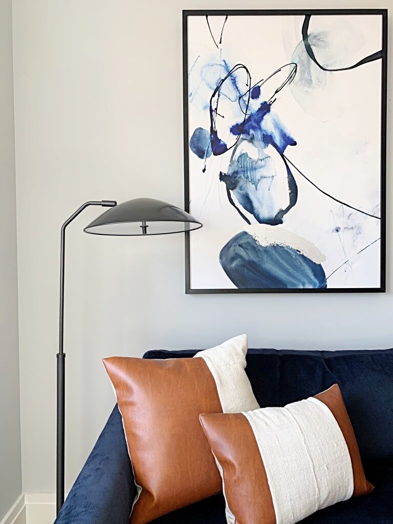
HALE NAVY (HC-154): Love color? Hale Navy is refreshing and absolutely stunning done in a full room or as an accent. As a true navy blue, it’s both contemporary and oh-so chic!

WHO KNEW?!:
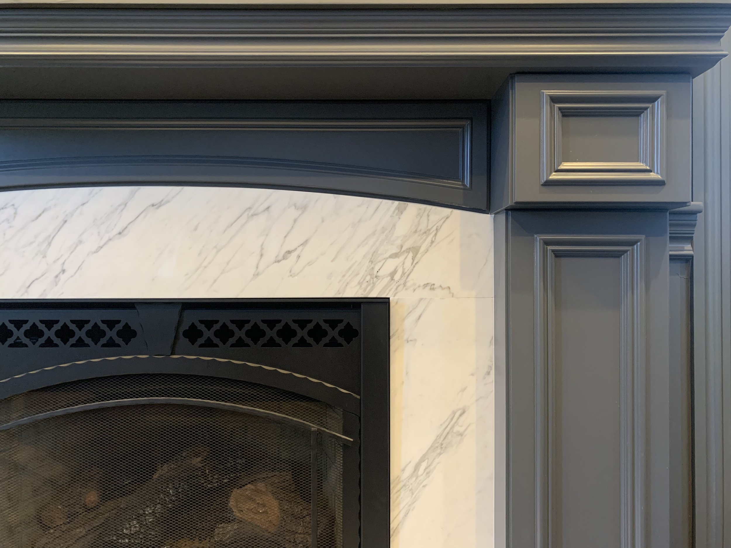
WROUGHT IRON (2124-10): If you’re looking for a show-stopper, you’ve found it! Wrought Iron is the perfect blend of black, gray and navy, making it a dramatic and luxurious choice. We love using it on built-ins for a sophisticated touch.

Now you’ve narrowed down your color choices and you’re excited to paint! Before you do, we recommend the following:
Buy samples of the colors to view in different areas of the room.
Paint samples on large pieces of white cardboard so that you view the true color and can easily move them throughout the room.
Look at the samples in different lights and at different times of the day.
Once you’re sure the color works in your space, you’re ready to paint!
Comment below what your favorite go-to paint color is and why you love it!