Book a Call
MENU
About
About Us
FAQ
Press
Take the Quiz
Interior Design Services
Portfolio
Blog
CONTACT
The Blog
How to Choose the Right Interior Designer (Without the Overwhelm)
Interior Design
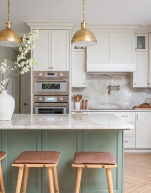
5 Secrets to a Luxe, Family-Friendly Home
Interior Design
The New Definition of Luxury Interior Design
Interior Design
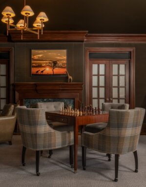
Long Island Design Spotlight: Summit Sanctuary
Interior Design
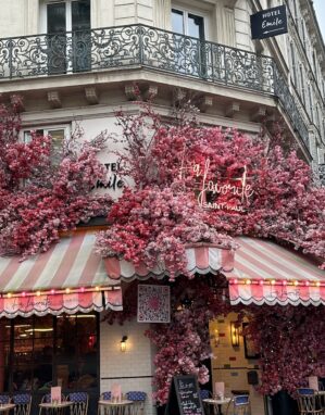
Looking for French Design Ideas? Steal Our Paris Itinerary
Interior Design
5 Luxe Upgrades to Elevate Your Home
Interior Design
What Does Your Home Scent Say About You?
Interior Design